JasperReports Server Home Page Redesign
Summary
The goal of this redesign project was to update the look and feel of the application home page with minimal changes to the underlying markup and javascript.
We also wanted to learn from users what was and wasn't useful to them on the home page. If we could accommodate these findings with minimal markup and script changes, we would make those modifications.
Problem
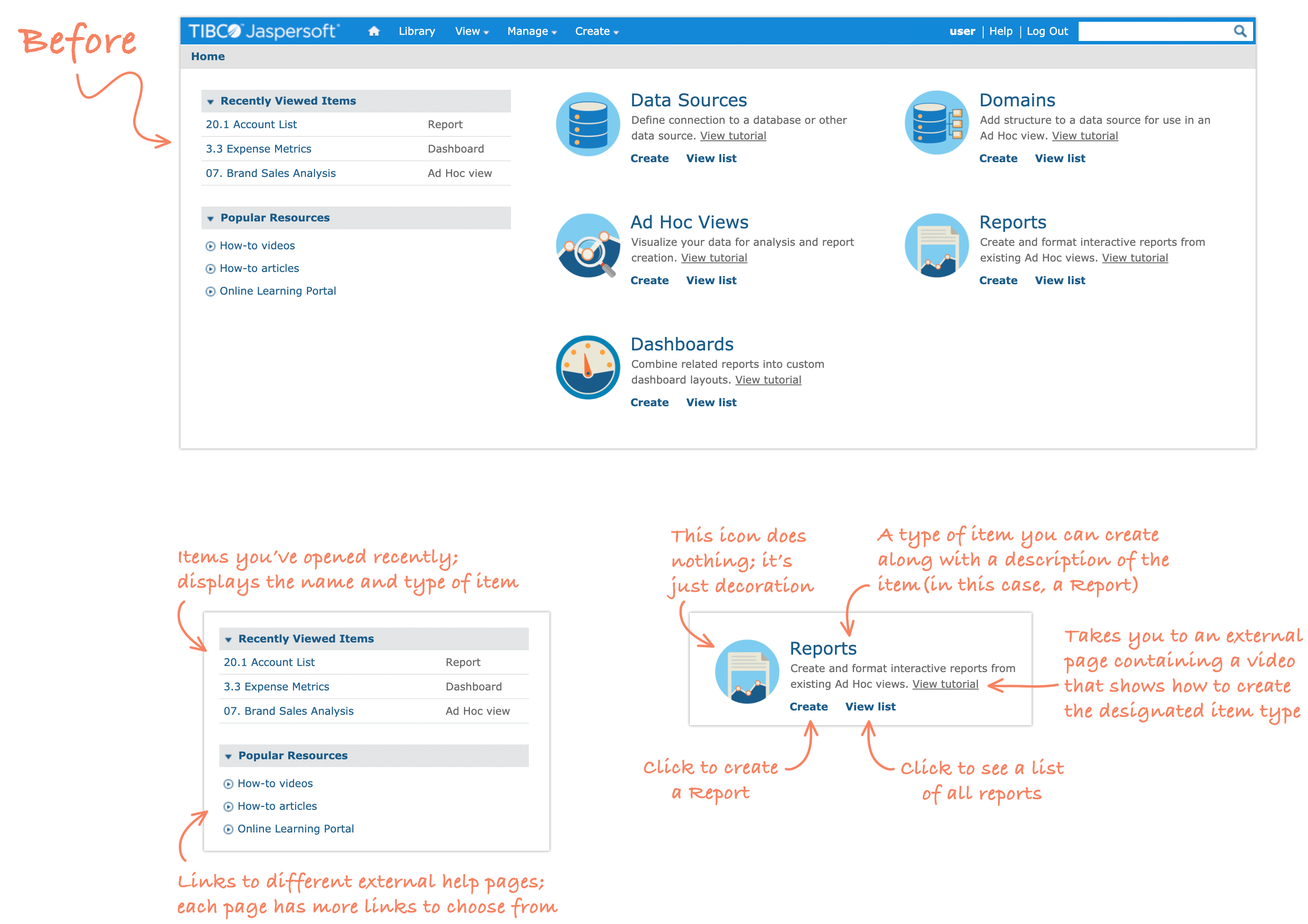
The JasperReports Server (JRS) UI looked quite outdated, and was identified as one of the top reasons for losing sales to our competitors. Completely overhauling the UI all at once would require development resources we didn't have.
Solution
A realistic approach to modernizing the look and feel of JRS was to make UI improvements throughout the product incrementally across multiple releases. We identified the Home page as the area of the application that would get the first UI refresh because it would take the least time. Changes would be made predominantly to the CSS.
Constraints
Engineering resources were limited even for a project with such narrow scope, so we needed to keep markup and script changes to a minimum.
Also, the home page had to be useful to free trial users as well as seasoned users. This means we needed to strike a balance between being helpful to new users without cluttering the page with too much for those who are more experienced.
Incorporating Research
The UX team had recently done an audit of the free trial experience for JRS. We found that some valuable resources are sent to trial users via email that either aren’t available or are hard to find within the application. This informed our decision to add an extra section to the home page with links to the video tutorials that trial users receive via email during the free trial.
Prototyping
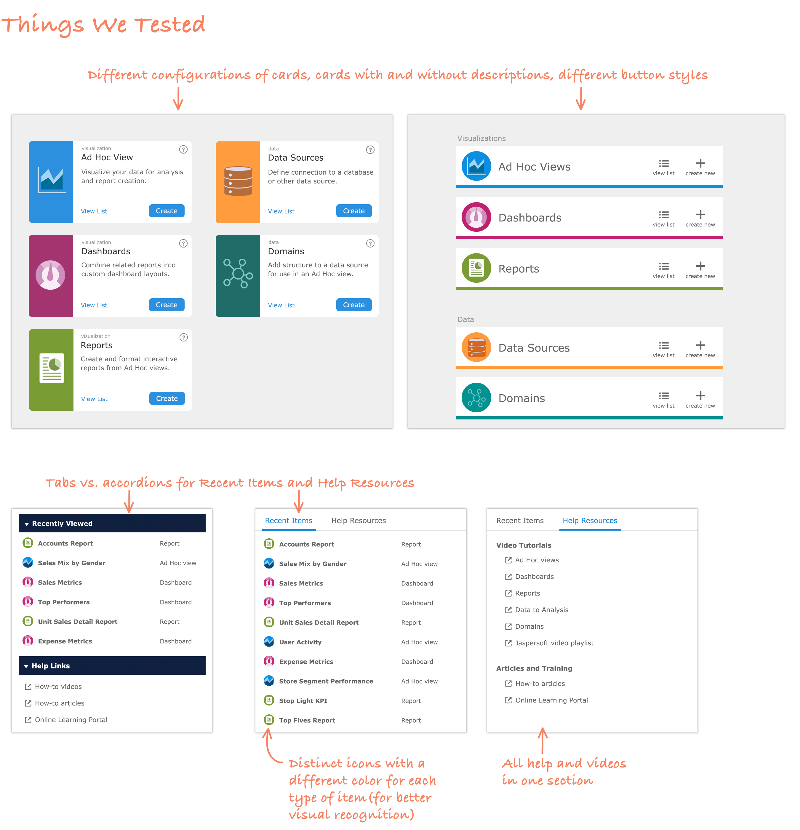
The UX team created dozens of designs, eventually narrowing it down to four that we would test with users.
Testing With Users
I built high-fidelity interactive prototypes that were tested with seven current customers over two weeks.
Test Findings
- Just as many users preferred the tabs as the accordion for the Recent Items and Help Resources.
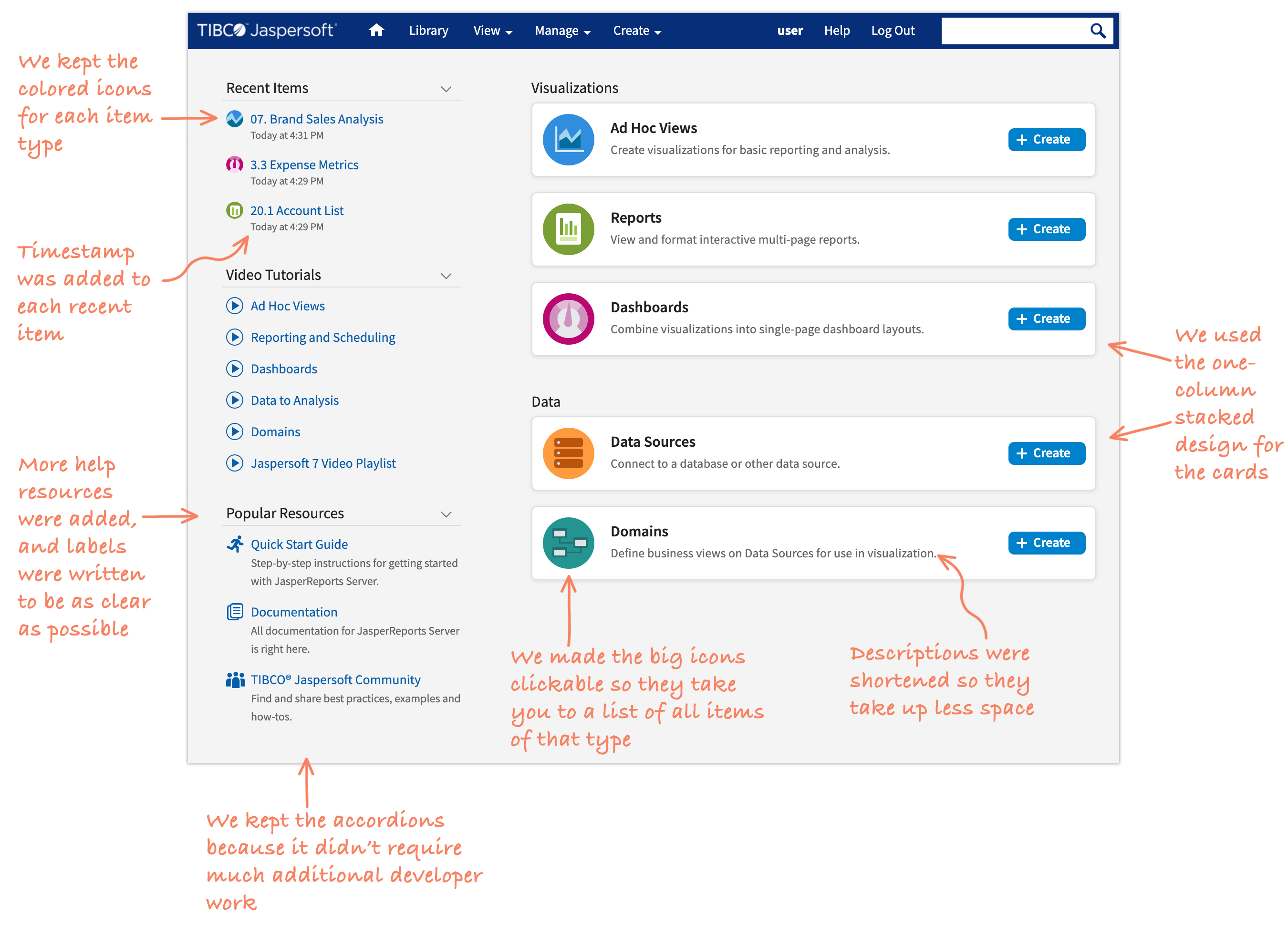
- Most users (five out of seven) preferred the cards stacked in one column instead of two columns.
- The Recent Items list would be more helpful if it contained the last modifed date for each item. Without it, users have to navigate to their file listing to get this information.
- Users frequently clicked on the large icon in the card for each type of item (Report, for example), but it doesn't do anything. Users expected it to take them to a list of that type of item.
- The different colored icons for each type of item was very helpful.
- The description inside the card for each item is not useful for experienced users.
Final Design
Other Team Members
- 1 Product Manager
- 1 Project Owner
- 1 Developer
- 2 UI/UX Designers
- 1 QA Engineer
My Contributions
- Created wireframes and high-fidelity designs
- Constructed clickable prototypes
- Conducted moderated user testing
- Wrote final HTML and CSS
Tools and Methods
- Research
- Testing
- Photoshop
- Sketch
- InVision
- HTML/CSS