Component Library
Summary
A small team of one developer and two designers set out to build a new component library that serves two types of users. For our developers the components must be scalable and maintainable. For our customers it must be embeddable and customizable.
Problem
The existing HTML/CSS architecture, which was based on the OOCSS (Object-Oriented CSS) methodology hadn’t held up well over time. While the methodology is sound, it was implemented with heavy use of cascading that was too dependent on a strictly-defined HTML structure. The result was a fragile UI with a vast number of components that were context-sensitive. It was difficult to maintain, and there was such an overabundance of one-off styles it defeated the purpose of a systemized architecture/design system.
Solution
Create a new HTML/CSS architecture that
- allows components to stand on their own and be used anywhere in our application
- has CSS class names that make sense to developers
- can be embedded into other applications without being affected by the parent application’s CSS, yet was still customizable
We decided to base our system on the SMACSS (Scalable and Modular Architecture for CSS) methodology. SMACSS is a flexible approach to the development of CSS architecture. Its underlying philosophy is that we must never assume an element has a single purpose that will never change. SMACCS assumes change will happen, and that we can plan for change to prevent future changes from complicating the work we’ve already done.
Constraints
The biggest constraint was resources. The engineering team was small; only one client team developer was designated to work on this project, and this was not his only project. Once completed, we knew we’d need to implement the components in our application incrementally. This meant it had to resemble the look and feel of our existing UI, with the long-term goal of updating the look and feel more easily in the future.
Audit the Existing UI
The first step was to do a component audit of the application. It was important to identify usage patterns, inconsistencies, and special requirements for any given component.
Select Technologies
We would make two significant changes.
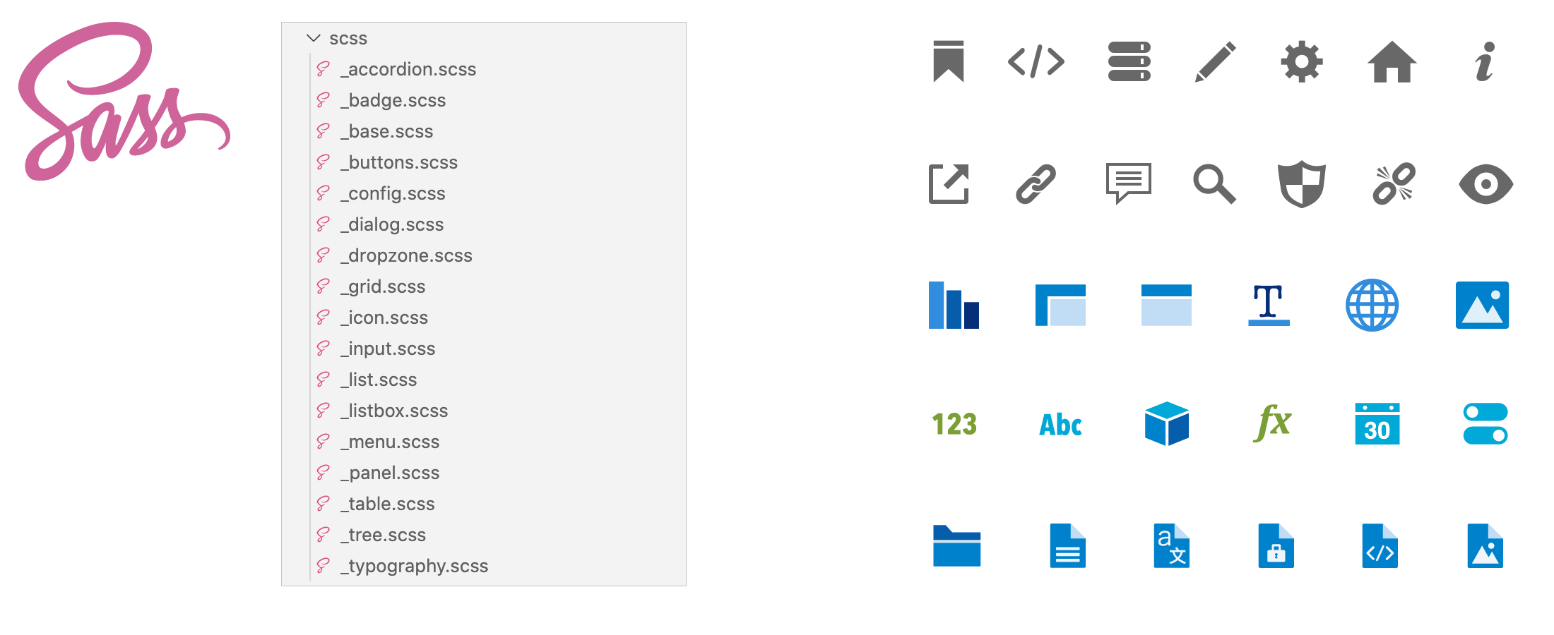
The first was to start using a CSS preprocessor. We evaluated both LESS and Sass, choosing Sass for compatibility purposes.
Secondly, we would start creating all our own icons and graphics. We had recently been acquired, and dealing with legal whenever we incorporated a new third-party graphic was time-consuming. We decided to use webfonts for basic glyph icons. Grunt would be used to generate the web font each time a new glyph icon was added. For multi-colored graphics we would create svg or png sprites.
Define CSS Naming Rules
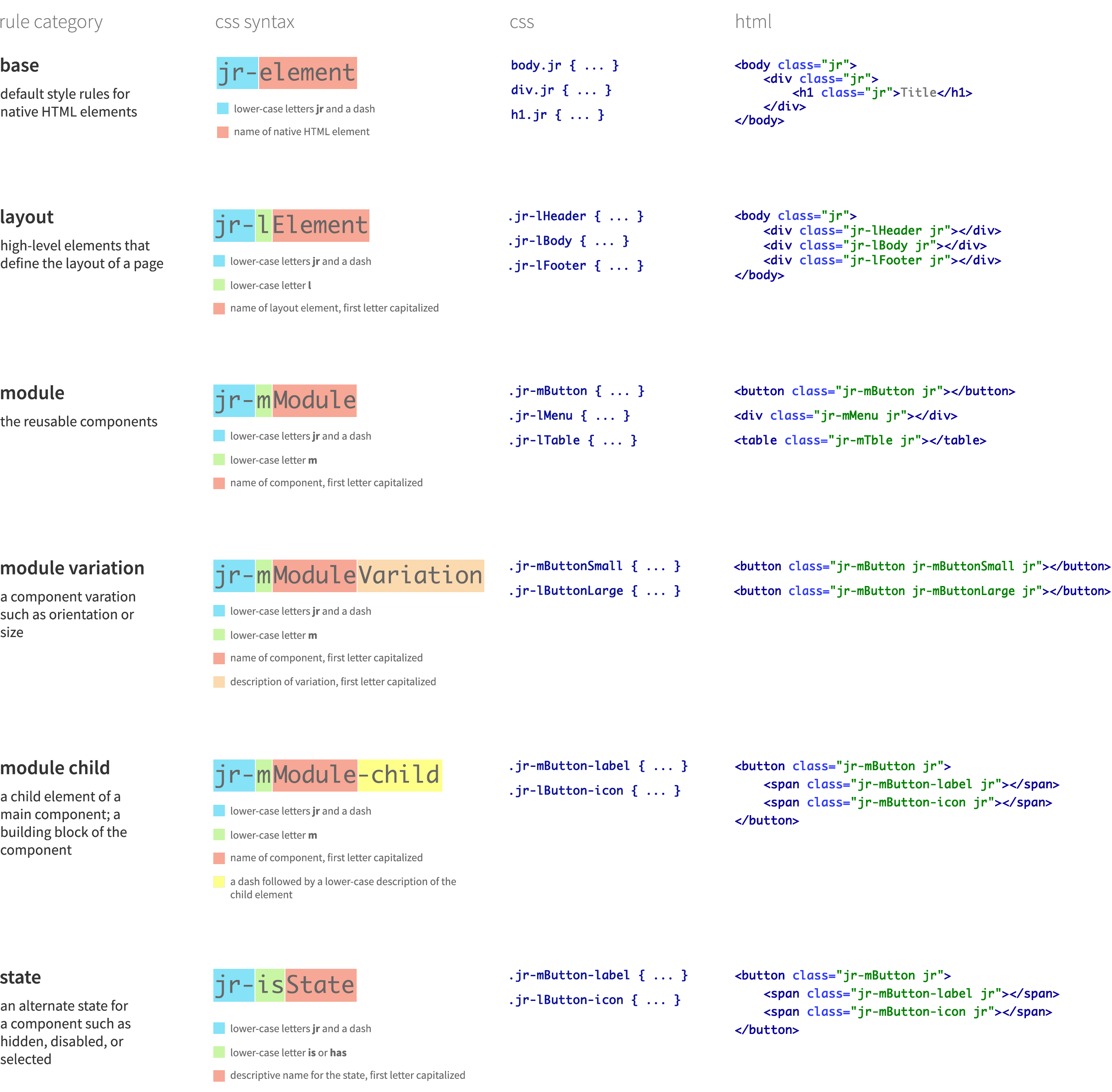
Naming is hard, but incredibly important. As a codebase gets bigger with multiple developers working on it, things can get difficult to manage if there is not a sensible agreed-upon naming convention. I researched various naming conventions, involving developers in the process. Between engineering and UX we decided on a naming convention that was a hybrid of two different methodologies: SMACSS and BEM (Block, Element, Modifier).
In addition to the hybrid naming convention, we also decided to add the prefix "jrs-" to all classnames. Some of our customers embed parts of our application into their own. By adding the prefix, we can prevent any classname conflicts between our classnames and host application classnames.
Lay the Foundation
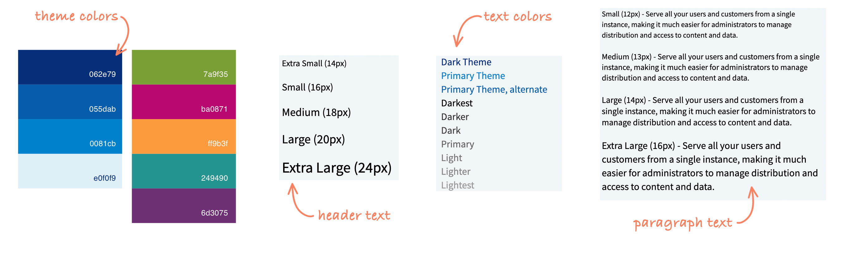
It was finally time to start designing. We started with the basics: colors, typography, and icons. The company that had recently acquired us had a style guide with a large selection of colors. We chose a limited number of colors from this large color palette. We needed to keep our typography unchanged at the beginning because we needed to retain the look and feel of our existing UI. The plan was to update it later when we could more easily propagate it through the entire application.
Build Components
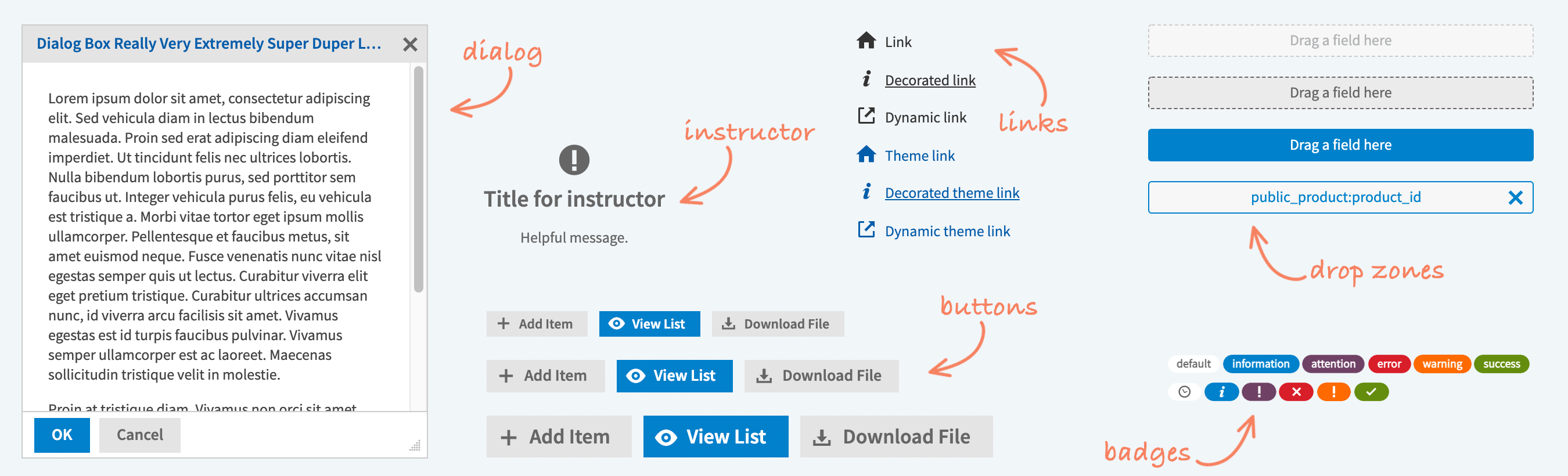
With the basics defined, we could build the actual static components. We started with the fundamental components such as buttons, menus, tabs, tooltips, and messages. The markup for each component was reviewed and iterated upon before being approved by development.
Other Team Members
- 1 Developer
- 1 UI Designer
My Contributions
- Designed all aspects of components
- Wrote all HTML/CSS
Tools and Methods
- Research
- Saas
- HTML/CSS